May 2026 - Introducing Rhea
A more compact Luma. Smaller spacing. Denser surfaces. Built for focused product interfaces.
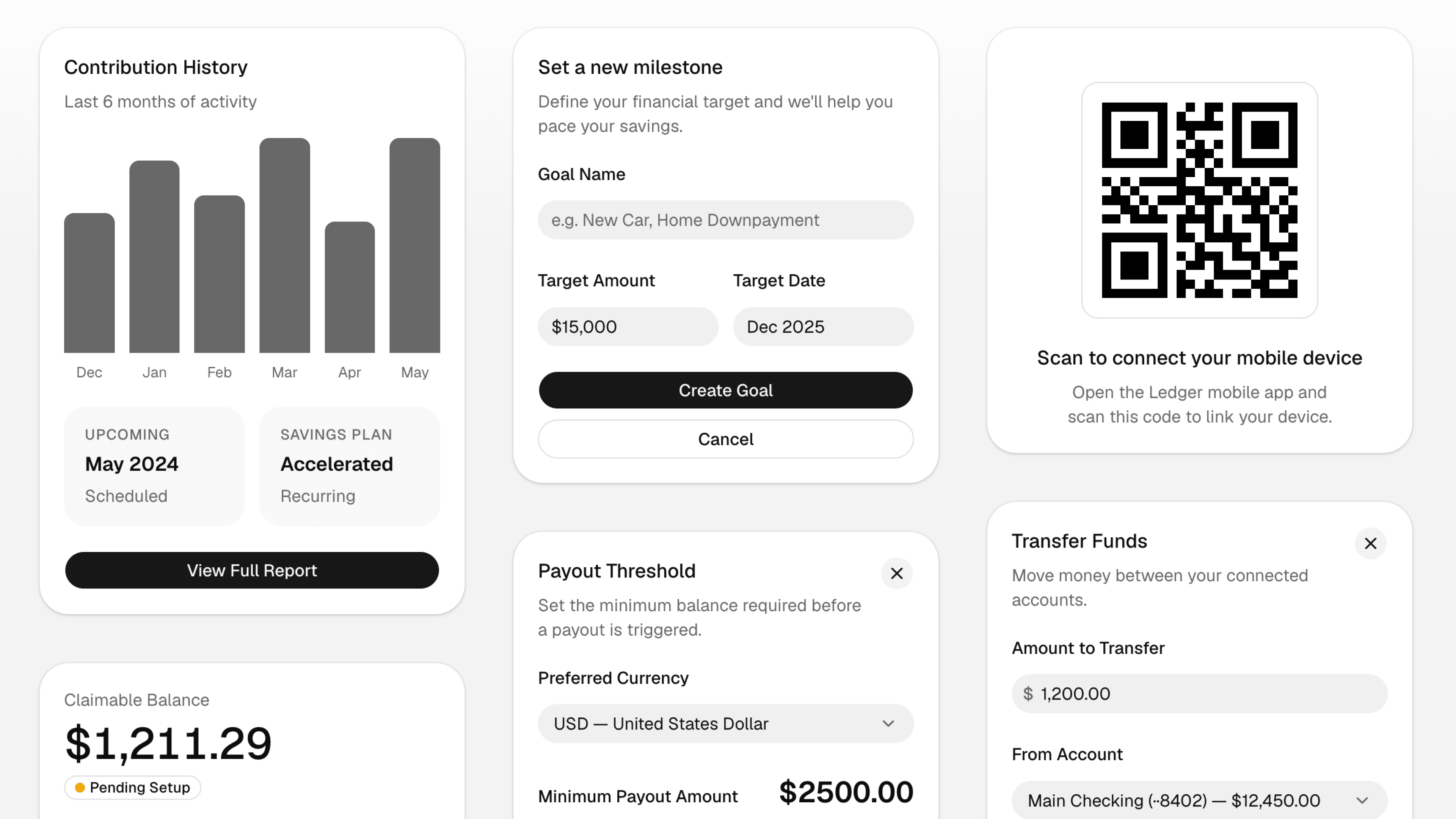
Introducing Rhea, a new shadcn/ui style. A more compact Luma. Smaller spacing. Denser surfaces. Built for focused product interfaces.
 Try Rhea in shadcn/create

Rhea started from a simple request we've heard a lot: Luma, but more compact. We looked at how people were using the new styles and what they were asking for, and the pattern was clear. A lot of teams wanted the softness and shape of Luma with tighter spacing, smaller controls, and more information density.
Rhea keeps the same rounded foundation, but makes it more compact for product interfaces where space matters. Buttons, inputs, menus, cards, and lists all sit a little tighter so the UI can carry more without feeling crowded.
Why a new style?
We considered making this a spacing tweak for Luma, but --spacing is a multiplier. Changing it would change what familiar utilities mean across your app. p-2, w-4, and m-16 would no longer mean the same size.
That tradeoff felt wrong. Compactness should not force you to relearn Tailwind's spacing scale or wonder whether a utility means something different in one style than another.
So Rhea is a new style instead. It lets us adjust component sizes, gaps, and density directly while keeping the underlying utility scale predictable.
Available now in shadcn/create for both Radix and Base UI.
Try Rhea