March 2024 - Introducing Blocks
Ready-made components for dashboards and authentication pages.
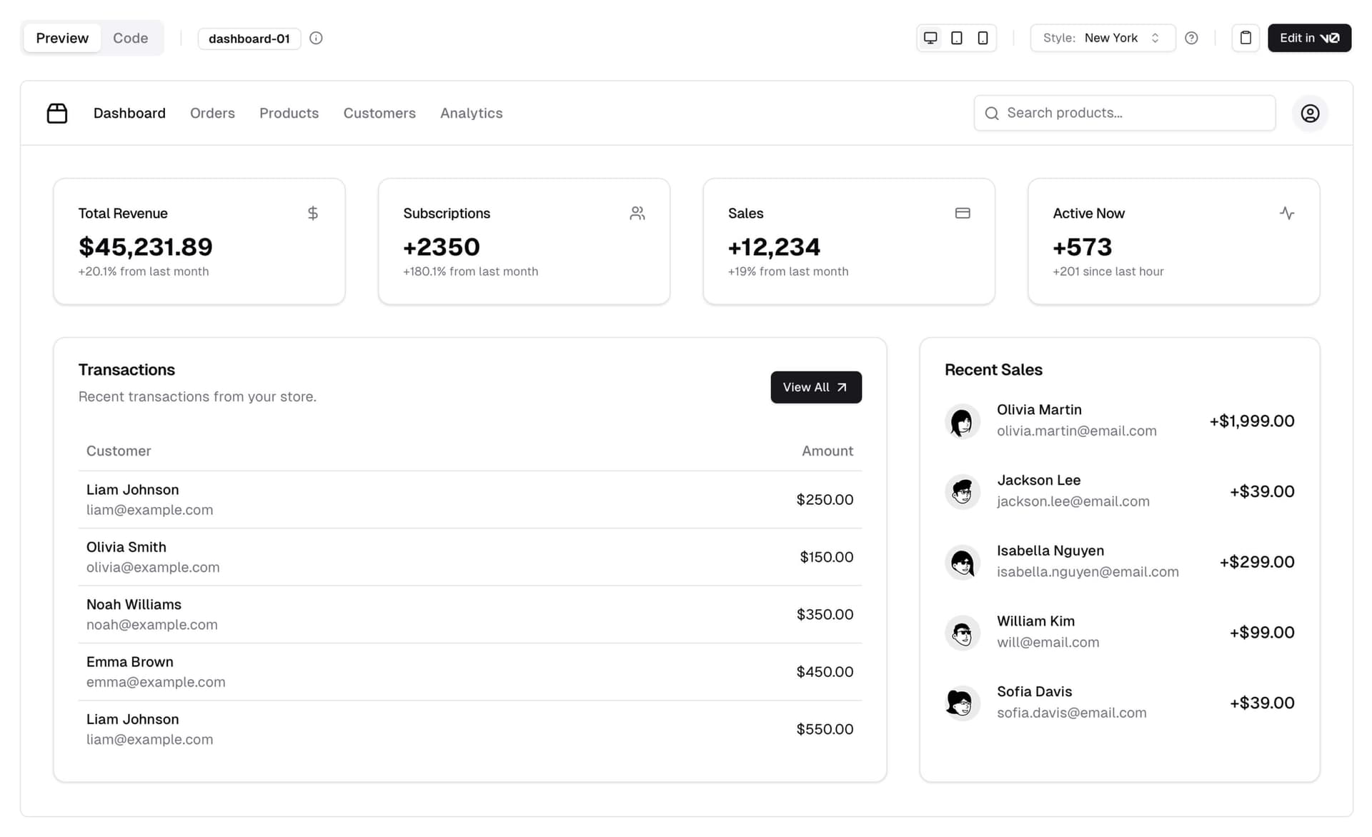
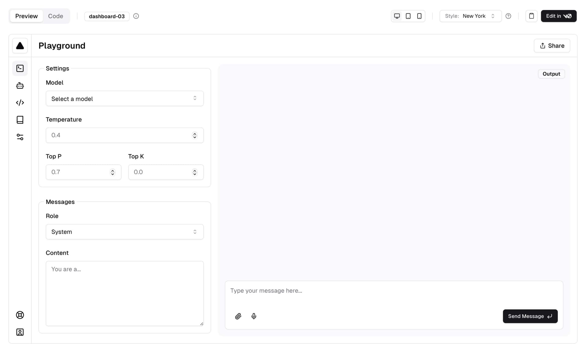
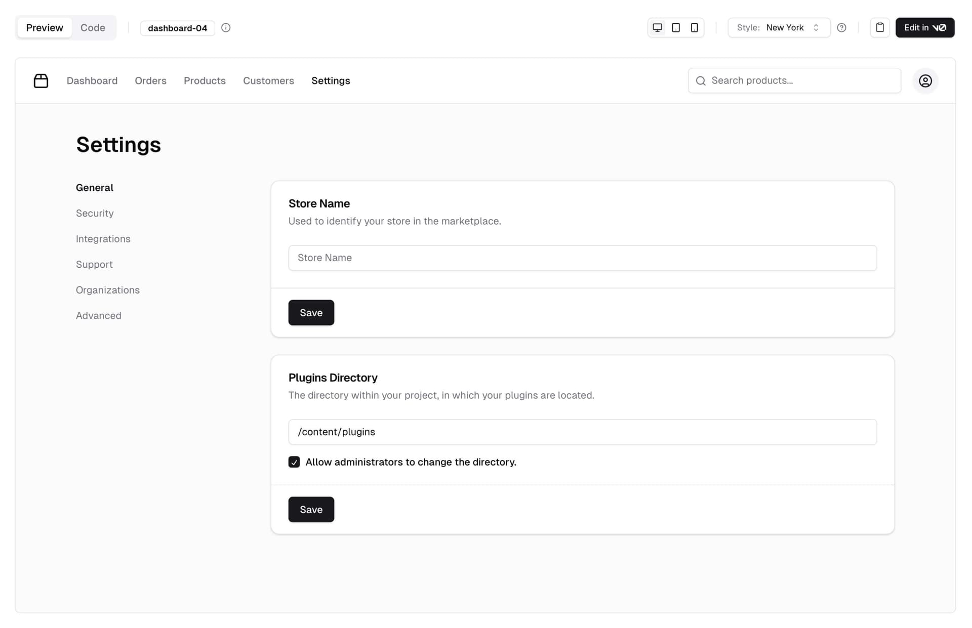
One of the most requested features since launch has been layouts: admin dashboards with sidebar, marketing page sections, cards and more.
Today, we're launching Blocks.
 View the blocks library

Blocks are ready-made components that you can use to build your apps. They are fully responsive, accessible, and composable, meaning they are built using the same principles as the rest of the components in shadcn/ui.
We're starting with dashboard layouts and authentication pages, with plans to add more blocks in the coming weeks.
Open Source
Blocks are open source. You can find the source on GitHub. Use them in your projects, customize them and contribute back.
 View the blocks library

Request a Block
We're also introducing a "Request a Block" feature. If there's a specific block you'd like to see, simply create a request on GitHub and the community can upvote and build it.
 View the blocks library

v0
If you have a v0 account, you can use the Edit in v0 feature to open the code on v0 for prompting and further generation.
That's it. Looking forward to seeing what you build with Blocks.